Saturday, April 27, 2013

Valley ~ Little White Schoolhouse


The Little White Schoolhouse in Valley, WA is a beloved building to the local community. The people of Valley expressed that their vision for this building is to design it to house a heritage museum. Working with one other classmate, Megan Pharmer, we were able to come up with a design that had all of the exhibits and technical needs of the community. Our overall concept is connected to the Elementary School next to the building that is designed with a river in mind. In our design of the Heritage Museum we wanted to connect the two building by also incorporating the river concept. In our museum, our team incorporated the geologic history of the area, the Colville Tribe, Mining and Logging in the 1900s, home life, and downstairs is a community meeting area and a space for local artist's to hang their work. The exterior site has a small and large wagon that is visible from the highway to visually connect tourists to the Little White Schoolhouse. In between the schoolhouse and the existing portables are metal schoolchildren sculptures running towards the school. Overall, I had a great experience working with real clients and the process of designing a heritage museum for these dedicated and enthusiastic clients.

Thursday, March 21, 2013

IA | Interior Architects Lecture

David Katsunai, a principal and Design Director if IA Interior Architects in Seattle, came to WSU to talk to students about the the importance of all disciplines of design being able to integrate and work with each other. His lecture was very insightful, and I learned a lot. Design is changing, and we need to adapt and learn ways to adhere to these changes. The following notes are sketches taken throughout his lecture. 


Monday, March 18, 2013

Visit to the Appaloosa Museum


My visit to the Appaloosa Museum in Moscow, Idaho gave me some ideas for ways to design and layout a successful heritage museum. We are currently working on a project in Valley, WA where we are to design the Old Valley Schoolhouse into a heritage museum. A lot of the features and layout in the Appaloosa Museum hit on the points that the people of Valley want to display in their future museum.

In this museum, they displayed their information in text on podiums in front of the exhibit. This is successful, but it's not fully accessible for people with disabilities. 

This shows a panoramic view of a curved wall in the museum. The layout and placement of the pieces on the wall is successful. The people of Valley expressed that they wanted something like this in their museum. 

A brick pathway that has the names of the people who donated to the museum is placed outside to recognize those who helped fund the museum. The people of Valley, thought of doing something similar to this for those who plan to donate. 

Wednesday, February 20, 2013

Webster Environmental and Earth Sciences & Physics Design

Washington State University's, Webster Hall, features Environmental and Earth Sciences, along with Physics exhibits. For this design, our team of nine, came up with different strategies to help gain efficiency and functionality through this space. There are seven geology case displays, moveable cases on the floor and physics cases places around the exhibit. The changes that we made to the floor plan, makes the space more engaging by the placement of the furniture, benches, and exhibits. Working in such a large group, I learned to manage my time very well. I kept on pace with due dates and what needed to be done.
   
Geology Exhibit Existing Floor Plan
   
Geology Exhibit Proposed Floor Plan 

 The seven wall displays, we decided as a group, that the most effective way to tell a story was to put it in chronological order. Our group was divided into groups of either one or two, to put together a case. Megan Pharmer and I put together the two cases of Environmental Hazards. We found the informational content of the poster, while Elizabeth put together the graphic display for all of the seven cases. Our posters are effective and successful because they are readable and easy to understand. I also believe the color scheme is cohesive to geology because it has natural colors. I learned a lot about each exhibit after this project, and feel more comfortable with talking about Museum design.


Environmental Hazards Case featuring Landslides & Floods There were six physics exhibits, and we were each given a specific exhibit to enhance the appearance and information about that topic. I had the Magnetic Materials exhibit, and by having a more intriguing display of information, with the correct and useful information, visitors will be more drawn to the exhibit.


Alicia Brandkamp & Taylor Brock put together the final posters for Phase 1, which include the original and proposed floor plans, and explains some of the proposed ideas that our group has for the update of the space. Throughout this process, I really enjoyed working in a group. The collaboration between the group was effective, and I learned a lot through the process.


 At the beginning of this project, I put together cases study posters of science museums that I found interesting. While doing this research, I learned a lot about museum design and what types of things are important to display. Putting together these posters, helped me understand the process and development of museums.


Tuesday, May 1, 2012

Study Models


For one of the first design steps for the Northern Pacific Railroad Depot, I built three study models with different spatial arrangements. These layouts are just the beginning stages of starting to develop a floor plan that will carry out through the design. The one that I mostly ended up using was the one on the top, the Single-Loaded study model. This model had only straight lines and no curves, and also had diagonal lines, which were also important throughout my design of the depot. 

Final Studio Boards


These are the final boards for the adaptive reuse project of the Northern Pacific Railroad Depot found in downtown Pullman, Washington. This overall building was to be designed into a gallery space, a studio and a residence personally designed for a regional artist. Catharine Newell, a kiln and fused glass artist is who I chose. Throughout the design I used the inspiration of the herringbone brick pattern found outside of the original depot. Line and repetition are found throughout the design and natural colors, such as blue and green are sought throughout. The design is ADA accessible and goes along Universal Design requirements, and also aids vision impairment. The egress and demolition plans were the ones that were new to me, and are important to show the accessibility of the design. The exterior brick of the original depot still remains throughout most of the walls of the new space, also windows and doors remain allowing for a sense of the space as it was. This project was fun because it allowed for the design to be derived specifically for one person, not just in general. Designing for Catharine Newell allowed for a much more personal experience and a lot of her ideas went into the design. 

Concept Model

Final Concept Model

Final Parti 

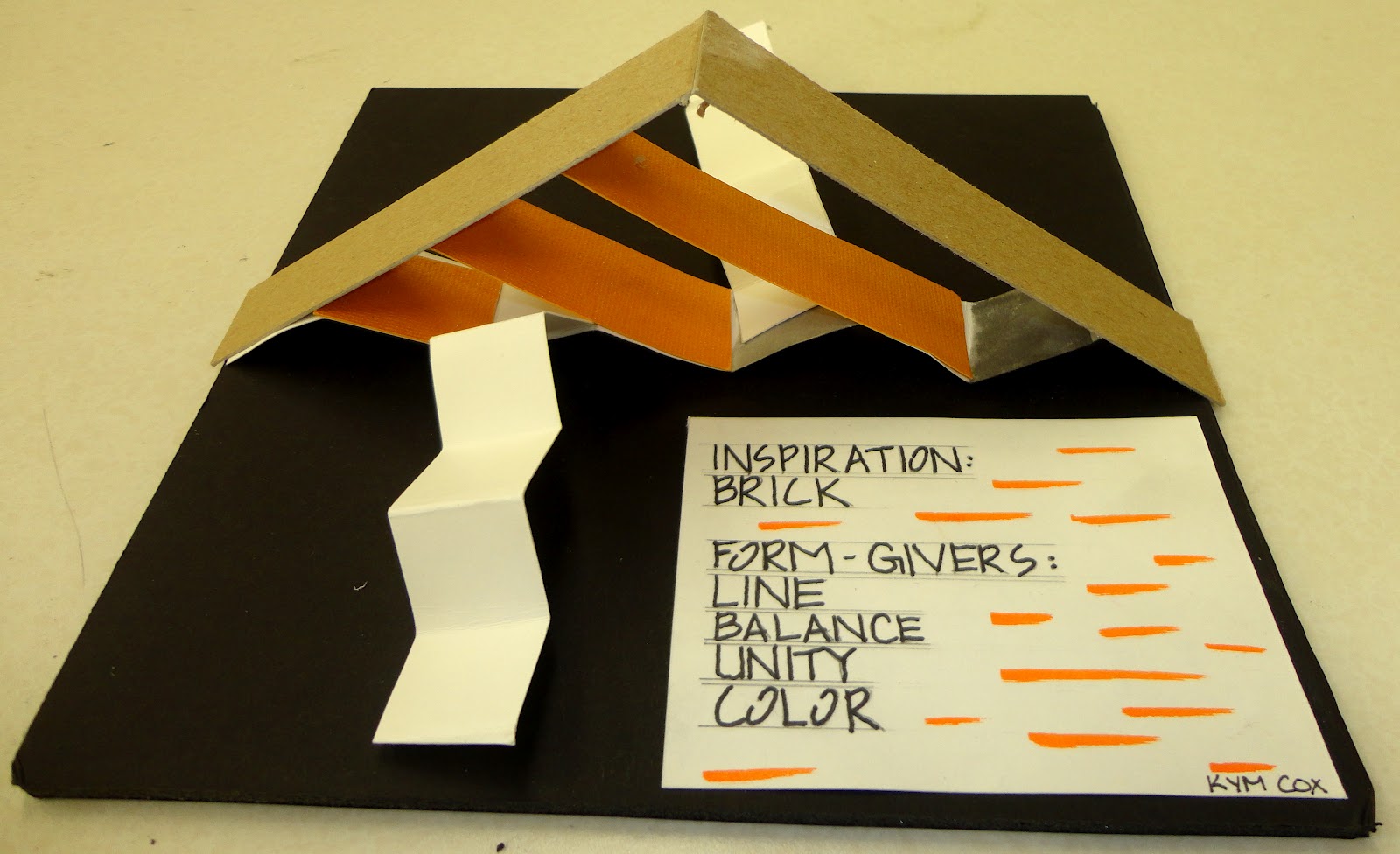
For my concept model for the Railroad Depot, I got my inspiration from the herringbone brick pattern on the outside walkway of the depot. The specific elements and principles that derived this model was the use of line, repetition, unity,balance and color. Line and repetition are the elements that are carried out throughout the whole design. In the model, I used the choice of orange, which I later changed, but I chose orange because it is a comforting and happy color. From putting together this model, I learned that I need to play around with more 3d images and ideas. The model could have been better if I had introduced more lines and views. 

Sunday, April 29, 2012

Textile

For my pattern, Line and Repetition are what allowed the pattern to work together. From the herringbone brick pattern, those are the elements that came out of it. The gradation of color use was applied in my design and also allows for a sense of place and movement. The textile worked very well and shows the positive and negative space that the brick also provides through the cracks in between each brick. This project helped me understand how to have one parti and be able to multiply it in different ways to make an interesting pattern. Using Spoonflower was a great way to learn how my ideas can be transferred onto fabric. It's much more real when you're able to move it around with your hands. 

Tuesday, March 27, 2012

Depot Client Artist Profile

During this stage of the design process, retrieving important information about my chosen artist, Catharine Newell, for the Northern Pacific Railroad Depot in downtown Pullman, was somewhat difficult. The main way that I got my resources were from a personal interview that I had with her over the phone that greatly helped me with being able to design a residential space, a studio and a gallery that would be suited just for her. The images selected on my posters were the chosen works of Newell's that I thought portrayed her art philosophy the most obviously. This part of the process was successful because the information that I retrieved is going to help me throughout the whole design process. A part that I am sort of fuzzy on going to be the use of materials in all of the spaces. Because most of her work is neutral and black and white, that leaves for a wide variety of color that can be placed throughout the depot. But overall, talking with Catharine was the most helpful.

Sunday, March 4, 2012

Inclusive Design Related to Vision Impairment

For the Northern Pacific Railroad Depot in Pullman, we were asked in teams to do some contextual research on the railroad and Pullman history, design styles prevalent at the time, designers of the time, adaptive reuse, the history of the Northern Pacific Railroad depot itself, and art galleries. I chose to to focus on inclusive design that relates to vision impairment. I researched a residential case study that is of a foundation in Wisconsin that has basically a show case house that allows designers and architects to further their knowledge on accessibility issue and ways to accomplish their goals to reach full-accessible designs. I also had to research strategies for the vision-impaired and find an art exhibit that displayed some of these needs. When doing the visual workshop recently described on my blog, many of these strategies are put into play to help those with certain disabilities. I learned a lot while doing this project, and will definitely consider many of these new findings to develop my depot design.

Vision Disability Workshop

Recently, I had the chance to put myself in somebody else's shoes and feel what it's like to be legally blind. As a glass we worked in partners of two and we each had to go through different obstacles with sunglasses that had petroleum jelly smeared on them to reduce our vision. Our obstacles consisted of walking around the cub, going up and down stairs, using the ATM machine, and using the elevator. Because I am "legally" blind without my contacts or glasses on, I know how it feels and looks like to not be able to see.

Some of the problems that I encountered were that there wasn't any braille on the ATM buttons. This would definitely cause a problem for someone who was visually impaired. Throughout my experience I realized how important certain precautions and accessible materials used throughout the built environment are. Even though it may be costly, it is worth it to those with those disabilities who need them on a daily basis.

When looking through the glasses, I experienced that one of the things that what I could see resembled a rainbow. Everything wasn't completely black, but colors looked smeared around and blotchy. I also figured out how useful it was to have a partner who was there to guide me through the process. Being reliant on someone else isn't what most of us are fond of, but if the built environment payed more contributions to those with disabilities they could act more independent.

Carrie Vielle's Studio

Our present project involves designing a small apartment, art gallery, retail area, and an artist studio for a regional artist of our choice. What better way to understand the functions of a great artist that visit one of our own professors studios. Carrie Vielle gave us many pointers on the do's and don't for any artist. Even though all artists creative process may be different, there are some things that they prefer that are in common. Such as the amount of space. Many artists are not necessarily clean, but many are cluttered with their work because they need so much surface or floor space to finish all of the different stages of their pieces. As for Carrie, she could not emphasize enough how much space was essential. Not only space, but storage for all of her materials, books, knick-knacks, her artwork, etc. Some other pointers that Carrie shared with us was that lighting is extremely important for most artists. Blinds on all windows are usually needed, and task lighting is very important. Also, know if the chosen artist separates their studio completely from their other living space; do they need a refrigerator, microwave, etc. This studio visit helped me visualize some of the specific questions I need to talk to my artist about in order to design a perfect studio for them.


These are some photos of Carrie's studio and also her AWESOME Alpaca's and Llamas! :)

Monday, February 27, 2012

Habitat For Humanity Design


We had the opportunity to design a house for Habitat for Humanity in teams of two. I had a wonderful experience working on this project because we got to work with the people who were going to build the house because they didn't know yet who was going to occupy the house. I imagine it was much like what a real design project would consist of. The design process was fun and I learned a lot about working with a teammate. Our design came from three inspirational words: Comfort, Tradition, and Individuality. We tied all of these concepts into the overall design.Working with such a small amount of space and fitting so many things into the plan was difficult, but we were successful with the final product. We also got some good feedback from the viewers when we were presenting these to Habitat for Humanity. I would love to have a chance to get to do something like this again.

Friday, December 16, 2011

Green & Solar Home Tours

Being a volunteer at the Green & Solar Home Tours in Spokane was a lot of fun and educating. I volunteered with Ellie Lokken and our duty was to hand out brochures and bracelets before visitors entered the houses, we also directed cars because the houses were difficult to locate. The home owners were extremely nice and offered coffee and donuts to us volunteers and we had a great experience touring all of the homes after we were done staffing. Meeting people in the industry and seeing the amazing houses was something I'm glad I didn't miss. I would like to continue volunteering for the next couple years, it was a wonderful experience.

Design Fair in Spokane

Attending the Design fair in Spokane ended up being a great opportunity to meet a lot of people in the design field and also learn how to be involved and learn about all the different products that were available. It also gave me the opportunity to sign up to be a student member of the International Interior Design Association. I received a lot of brochures and catalogs that show the products and how to contact people if I had further questions about their products. Some of the businesses I got to learn about were Meyer Wells, Design Nine group, Formica, The Masonry Center, Trikes, Pulp studio, T & A supply Company, Wieland, Kimball Office, Forbo, Roppe, LG Hausys, and a couple more. All of the people I talked to were extremely nice and excited about future designers. I'm glad I took this opportunity to learn about all these products, and have the opportunity to learn more. This photo on the right is an example of what is created by Pulp Studio and their glass imaging of SentryGlass Expressions.

Jim Olsen

Jim Olsen is a well respected Architect and has brought a great touch to the world or design. One of his main influences came from his father, who somewhere along these lines, told him, "If you want to be happy, do what you love." Olsen took this advice and ran with it. He realized designing houses and building was what made him truly happy. Many of his designs are influenced by nature and include natural light throughout his spaces. Some of his favorite designs come from Ancient Egypt and Traditional Japan. Olsen expresses how it is important that when working with clients, the end product should be a little bit of them and a little bit of yourself. Art is also another way to express yourself throughout the built environment of your creations, because art inspires design ideas. In his designs, you will often find cement walls and natural light. The photo on the right is one of his creations. In his
lecture, he wanted to get the point across that becoming friends with your clients is important and you should take the opportunity to achieve the goal that they want because they will be life long friends and they are likely to love your work and want more! Olsen left us with some last words that, "Stars are about endless possibilities."

Thursday, December 15, 2011

Habitat for Humanity

Being a part of the construction crew half a day at this cite for habitat for humanity was an unforgettable experience that I would love to do again! My job throughout the day was blocking, which consists of the sawing of boards that were placed and nailed in between the wall boards to have a place to nail things into when the walls were put up. It was more difficult than I thought it would be, but the product was worth it and I had a fun time sawing the wood pieces. I never have seen this beginning process of a house being built, so it was interesting to see all of the cables and foundation of the house coming together. The lunch that was provided was also great! I had an overall great time and I'm happy we got the opportunity to be involved in this experience. 

Photo of the first hard working group!

Wheelchair Experience


My wheelchair experience with Ashley Arnold was very interesting, but a little fun was added into it. Going through the process of having to go in and out of doors, even though accessible, was difficult. In the Architecture building, the library doesn't have an accessible door, which also made it hard to figure out how to get through, but after a lot of turning and nudging it was possible. A space to be accessible has never seemed so important until I had experienced it for myself. Wheeling around in the corridors and seeing how the bathrooms were difficult to move around in and the mirrors were too high, seems as though those in wheelchairs have it harder than most people think. 

Photo of me getting a book from the library bookshelf.

Photo of what might happen since there is no place in this curb for a wheelchair to go through. Safety should be a big part of designing, and making sure everything is accessible is important. 

Seattle Field Trip


I had an amazing time on the Seattle trip with this years design students. Being able to see different firms and job shadowing Melinda SeChrist at SeChrist design was an experience I will never forget. Job shadowing was hands down the most fun part of our time in Seattle. I got to experience the process of the steps in an actual project. SeChrist design specializes in hospitality, so I got to see a designer choose certain fabric materials that would be placed in a nursing home. Also, I got in on the idea of which wood to choose for a project that involved 3 different apartments. Even though hospitality isn't the field I want to pursue, it opened my eyes to the reality of design and how important it really is. I would love to go back and visit the places that we did. I had the greatest time!

Thursday, July 28, 2011

Abstract

 
This is one of my boards showing my final seat and shelter drawn from a perspective view, and also photos of my seat and shelter during at 9:00 am, 12:00 pm, and 4:00 pm.
 
This board show my seat and shelters plan, section,  south elevation, and north elevation. The materials for this project were fun to pick out.
 
This is my final digital poster that has my final abstract model and final seat and shelter model on it.  Philippe Starck, my inspiration, is also acknowledged on this poster, along with my concept statement.
 
This is my final seat and shelter mode. 
 
This is my found object and inspiration,

This project was definitely time consuming and took a lot of hard work and dedication, but overall it was a good experience and I would enjoy doing it again. The beginning process makes you think in a very abstract way that I'm not used to or familiar with, but it was fun to learn how to. There would be some things that I would change, but I'm happy with my final seat and shelter. The biggest challenge for this project was creating the 3D abstract models. I now know that sketching is extremely important when coming up with ideas to create a model. During this process I have learned how my mind interprets different aspects of an object.