Friday, December 16, 2011
Green & Solar Home Tours
Being a volunteer at the Green & Solar Home Tours in Spokane was a lot of fun and educating. I volunteered with Ellie Lokken and our duty was to hand out brochures and bracelets before visitors entered the houses, we also directed cars because the houses were difficult to locate. The home owners were extremely nice and offered coffee and donuts to us volunteers and we had a great experience touring all of the homes after we were done staffing. Meeting people in the industry and seeing the amazing houses was something I'm glad I didn't miss. I would like to continue volunteering for the next couple years, it was a wonderful experience.
Design Fair in Spokane

Jim Olsen

lecture, he wanted to get the point across that becoming friends with your clients is important and you should take the opportunity to achieve the goal that they want because they will be life long friends and they are likely to love your work and want more! Olsen left us with some last words that, "Stars are about endless possibilities."
Thursday, December 15, 2011
Habitat for Humanity
Being a part of the construction crew half a day at this cite for habitat for humanity was an unforgettable experience that I would love to do again! My job throughout the day was blocking, which consists of the sawing of boards that were placed and nailed in between the wall boards to have a place to nail things into when the walls were put up. It was more difficult than I thought it would be, but the product was worth it and I had a fun time sawing the wood pieces. I never have seen this beginning process of a house being built, so it was interesting to see all of the cables and foundation of the house coming together. The lunch that was provided was also great! I had an overall great time and I'm happy we got the opportunity to be involved in this experience.

Photo of the first hard working group!
Wheelchair Experience
My wheelchair experience with Ashley Arnold was very interesting, but a little fun was added into it. Going through the process of having to go in and out of doors, even though accessible, was difficult. In the Architecture building, the library doesn't have an accessible door, which also made it hard to figure out how to get through, but after a lot of turning and nudging it was possible. A space to be accessible has never seemed so important until I had experienced it for myself. Wheeling around in the corridors and seeing how the bathrooms were difficult to move around in and the mirrors were too high, seems as though those in wheelchairs have it harder than most people think.

Photo of me getting a book from the library bookshelf.

Photo of what might happen since there is no place in this curb for a wheelchair to go through. Safety should be a big part of designing, and making sure everything is accessible is important.
Seattle Field Trip
I had an amazing time on the Seattle trip with this years design students. Being able to see different firms and job shadowing Melinda SeChrist at SeChrist design was an experience I will never forget. Job shadowing was hands down the most fun part of our time in Seattle. I got to experience the process of the steps in an actual project. SeChrist design specializes in hospitality, so I got to see a designer choose certain fabric materials that would be placed in a nursing home. Also, I got in on the idea of which wood to choose for a project that involved 3 different apartments. Even though hospitality isn't the field I want to pursue, it opened my eyes to the reality of design and how important it really is. I would love to go back and visit the places that we did. I had the greatest time!

Thursday, July 28, 2011
Abstract

This is one of my boards showing my final seat and shelter drawn from a perspective view, and also photos of my seat and shelter during at 9:00 am, 12:00 pm, and 4:00 pm.

This board show my seat and shelters plan, section, south elevation, and north elevation. The materials for this project were fun to pick out.

This is my final digital poster that has my final abstract model and final seat and shelter model on it. Philippe Starck, my inspiration, is also acknowledged on this poster, along with my concept statement.

This is my final seat and shelter mode.

This is my found object and inspiration,
This project was definitely time consuming and took a lot of hard work and dedication, but overall it was a good experience and I would enjoy doing it again. The beginning process makes you think in a very abstract way that I'm not used to or familiar with, but it was fun to learn how to. There would be some things that I would change, but I'm happy with my final seat and shelter. The biggest challenge for this project was creating the 3D abstract models. I now know that sketching is extremely important when coming up with ideas to create a model. During this process I have learned how my mind interprets different aspects of an object.
Perspective of Chair Sketch

Drawing this chair in perspective was not as challenging as I thought it was going to be, and I know how to interpret the way the chair is sitting and how the way I'm looking at it affects the drawing.
Negative Space Sketch

Drawing structures in negative space has gotten easier for me and it's actually fun and interesting to do. You learn about the surrounding space and how it effects the area.
Exterior Sketch

This sketch was a little bit difficult for me because I am not the best at drawing from a perspective view, but I am getting better at it. This exterior sketch was definitely good practice for me.
Key Sketch

This key sketch was the first sketch during this summer class. Since I have already done some of these sketches before, most of them turned out better than the older ones. Especially this key sketch, which ended up being fun and I learned how to create an object the exact same as it is.
Philippe Starck Poster

Philippe Starck was my chosen Designer and Architect who inspires me. His work is amazing and the reasoning behind his creations is impressing and unique. Learning about his work really enhanced my design skills and enhanced my ability to think out of the box.
Elements & Principles of Design


Learning about the Elements and Principles of Design was very handy. I now know how to look at a space and know how to relate the structure to the elements and principles of design. This poster was inspired from the Ancient Roman time period.
Modern Furniture Poster

This poster was created by Brecken and I, based on the objective of finding modern furniture and incorporated the dimensions of the furniture in the poster. This was an interesting poster to finish because it is difficult to find furniture on the internet that tells you the dimensions of it.
Textile Pattern


This is my 10x10 pattern turned into a 30x30 pattern. All of the elements in this designed were chosen from the Ancient Roman time. The background is made of Roman brick work that was often used during that time period. The vertical coins are Roman coins, and the other circular vertical images are Roman marble tables. This project enhanced my ability to create posters in InDesign, which is always fun and interesting.
Concept Statement
My idea generator was inspired by the use of the elements and principles of design used within the architecture and design of the creations during the Ancient Roman period. The Romans incorporated many columns in their designs and that explains the use of the roman coins on the side in vertical lines in the textile pattern. The background is put together by the repetition of bricks, which the use of Ostia rocks in ancient Rome is common. The use of the Roman table in the center of the pattern is significant because the Romans often used this type of pattern in their architecture. The main emphasis is on the marble table because it pops out and grabs your attention.
Geometric Pattern

My Geometric Pattern was inspired by the triad color scheme with the dominate colors: pink green and yellow. Photoshop is an amazing way to learn how to distort pictures and turn them into looking like something completely different. This project made me think about how to put the colors together and also learn how to use to tools in Photoshop. .
Friday, May 6, 2011


Wednesday, April 20, 2011
Resume

Monday, April 11, 2011
Logo
Wednesday, February 16, 2011
Mind Map Sketch

My mind sketch was centralized on the word "beauty" because there are so many things that pop into my head when this topic comes to mind. This was a fun way to explore my thoughts and my perceptions of what my mind process consists of. When looking over the piece when I was finished I realized how random my thoughts were. This is not in a bad way, but it was a good experience to learn a little about myself.
Fruit Sketch

Before creating my fruit sketch I retrieved a banana, two oranges, an apple, and a table to arrange these fruit. I sketched the view of the fruit then realized I had not used to cross hatching technique that we were supposed to learn how to draw with. Later on I re-created this image and it was a million times better. Now I consider cross hatching to be a fun and unique technique.
Key Sketch

This key sketch was the first sketch that I did in this class. It was exciting to get the feel of looking at an object and figuring out the different views and how the light hits it, which is new to me with my almost non existent knowledge of sketching. Even though these keys could use a bit more detail and more shading, I got the gist of the total image. I am looking forward to looking at my drawings at the end of the semester to see how much I've grown.
Chair View Sketch

Drawing this chair from my dorm floor lounge was harder than I anticipated. This sketch consisted of drawing the top, side view, underside, front, and in perspective. The front view I belief was the toughest to complete. This sketch helped me sketch the exact image that i am looking at from any given angle.
Monday, February 14, 2011
Geometric Pattern
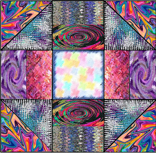
While going through the process of finding unique images that would incorporate well together, it definitely took me awhile. I still wish that I could change some of the images and I would probably chose to contrast them differently. Most likely changing some of the darker images to brighter ones. The fun aspect of this design was figuring out all of the tools that Photoshop has to offer. There are so many things you can do to change around and distort a picture to look nothing like the original piece. In the end, I am still happy with my pattern. I think it is bold and also a bit weird and different, which is right up my alley.
Heritage Textile

Grasping Your Heritage
My Idea Generator came from remembering when my great uncle used to send post cards from Germany during my childhood. The stamps were the part that intrigued me the most, which helped choose textiles that represented each heritage in a different way (German, Irish and Swedish). My background (stamps), reveals the importance of each image on the stamp. The clover expresses to live at ease and with peace, and the lines on the design exhibit a sense of profoundness which are determined by the German pine flag. Each element of the space reflect on a piece of the heritage. Incorporated throughout the design shows the unity of texture and colors that are expressed in the full image.

Beginning to process of my heritage textile began with an phone conversation with my dad. He gave me all the info about my family heritage that I had no idea about, and I was greatly intrigued. Having a little bit of German, Irish, Swedish, and English in me is fascinating. Also all the stories I was told about how my family has traveled from place to place. I think my textile flows well together with the lined images being part of the German flag that is beneficial to the repetition. I decided to use the image of a clover because that is the main image that comes to mind when I think of Ireland. My background also plays a big role in my German heritage, which relates to how I was always intrigued by stamps that I used to receive from there. If I was to do this project again, I would most likely change the clover image and choose an image that goes more in depth about Irish heritage. Overall, I enjoyed doing this project. I take great value in what I have learned about my heritage and am proud of who I am.
Subscribe to:
Comments (Atom)